Landing pages are the heart of digital marketing. Whether you’re running an ad campaign, promoting a new product, or trying to capture leads, optimizing landing pages for conversions is crucial. And trust me, I’ve been through the trial and error process of figuring out what works and what doesn’t.
In this post, I’m sharing my journey with you—the practical steps, tools, and tips that helped me fine-tune my landing pages and, most importantly, boost my conversion rates. So grab your favorite coffee (or tea) and let’s get started on making your landing pages work harder for you.
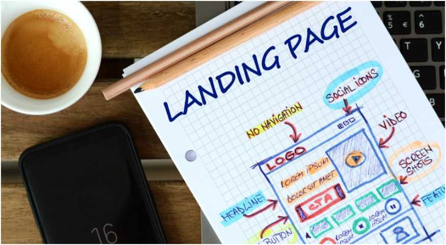
What Makes a Landing Page Convert?

You’ve probably come across landing pages that just didn’t click—whether it was the design, the messaging, or the lack of clear direction.
A landing page is more than just a place where people land; it needs to align with your audience’s intent and guide them to take a specific action. And when I say “specific,” I mean one action. Don’t overload them with options.
From my own experience, here’s what makes a landing page convert:
- Clear messaging: What are you offering, and why should they care?
- Frictionless design: A smooth, easy path to action.
- Urgency and value: The promise of immediate benefit, whether it’s a free download, special offer, or exclusive content.
How Can You Craft a Headline That Demands Attention?
The headline is the first thing your visitors see, and if it doesn’t speak to their needs immediately, they’ll bounce.
I used to overcomplicate my headlines, but then I realized—simplicity works best. Your headline should answer these three things:
- What is the value you offer?
- Why should they care now?
- How will it help them?
For instance, instead of a generic “Get Started Today,” I found better results with something like “Start Your Free Trial and Save 50% Today!” This immediately communicates value and urgency, enticing people to keep reading.
Why Does a Simple Design Help?
Let’s be honest: no one wants to wade through a cluttered page filled with distractions. When I first launched my landing page, I made the mistake of thinking more was better—more text, more images, more buttons. Guess what? That just led to more confusion and fewer clicks.
A simple design allows the message to stand out, guides the user’s eye to where you want it to go, and keeps them focused on the task at hand. I learned that:
- Remove unnecessary menus: Users shouldn’t be able to click away from your page.
- White space: Gives breathing room for the content and makes it easier to digest.
- Contrasting colors: Make your call to action (CTA) stand out.
By minimizing distractions, your visitors will stay focused on what’s most important: converting.
How to Craft an Irresistible Call to Action (CTA)?
Oh, the CTA. It’s the button or link that gets your visitors to take the next step. After all, you want them to act, right? Here’s a big tip: make your CTA button stand out like it’s the star of the show.
What I learned through testing was that the CTA should:
- Be action-oriented: Instead of “Submit,” use something like “Download Now” or “Get Started.”
- Stand out visually: Use a color that contrasts with the rest of your page.
- Be placed strategically: Ideally, it should be above the fold (so users don’t have to scroll to see it), and then again at the bottom of the page.
Here’s a little secret: I used to think one CTA was enough. Turns out, offering a second CTA at the end of the page worked wonders for me, especially for those who made it to the bottom and needed that final push.
Why Should You Optimize for Mobile?
I can’t tell you how many times I’ve been frustrated by a landing page that wasn’t mobile-friendly. It’s 2025—people are browsing and shopping from their phones more than ever. A poorly optimized landing page can tank your conversions before you even get started. That’s why I prioritize:
- Fast loading times: You have seconds to make a good impression. If your page takes too long to load, visitors will leave before they even see what you’re offering.
- Mobile-friendly design: Ensure your content scales properly on small screens. A mobile user should have the same experience as a desktop user.
For me, this meant choosing a responsive design template that automatically adjusted for mobile, ensuring my pages looked great on every device.
How to Build Trust with Social Proof?

Here’s another tip I learned through trial and error: people trust people. Social proof is a powerful tool for building trust on your landing page. Adding elements like:
- Customer testimonials: When real people talk about their positive experiences, others are more likely to follow suit.
- Trust badges: Think SSL certificates, money-back guarantees, or recognized partnerships.
- “As seen in” logos: If your product has been featured in reputable media, flaunt it!
I saw a noticeable increase in conversions when I added just a couple of customer testimonials and security badges to my page. It helps visitors feel safer and more confident about their decision.
A Step-by-Step Guide to Optimizing Your Landing Page
If you want to take your landing page to the next level, follow this step-by-step process:
- Set a clear objective: What do you want your visitors to do? Download a guide? Sign up for a newsletter? Make a purchase?
- Create a strong headline: Make it clear, concise, and benefit-driven.
- Design with simplicity: Remove anything that might distract or confuse your visitors.
- Add a compelling CTA: Use action-oriented language and make the button stand out visually.
- Use social proof: Add testimonials, reviews, and trust badges to build credibility.
- Test and tweak: Conduct A/B tests to find out what works best and keep optimizing.
Frequently Asked Questions (FAQs)
1. How do I know if my landing page is performing well?
A good indicator is the conversion rate—how many visitors are taking the action you want. If your conversions are low, consider A/B testing different headlines, CTAs, or layouts to see what resonates best with your audience.
2. Should I use images or videos on my landing page?
Absolutely, but with caution. A high-quality image or video can enhance your message, but don’t let it overwhelm your content. Use visuals that support your offer, not distract from it.
3. How often should I update my landing page?
It depends on your product or service, but I recommend reviewing your landing page every 3–6 months. If there are changes in your offerings or market trends, it’s time to refresh your page and make sure it’s still optimized for conversions.
4. Can I use the same landing page for all campaigns?
Not always. While it’s tempting to reuse a single page, different campaigns often require specific messaging and offers. Tailor your landing page to the unique goals of each campaign for the best results.
Time to Make Your Landing Page Work for You!
Optimizing landing pages for conversions isn’t a one-and-done task—it’s an ongoing process. Keep testing, tweaking, and improving based on data to find what works best for your audience.
Trust me, with a little effort, you’ll see your conversion rates rise, and your business will thank you.
Here’s to better, higher-converting landing pages! You’ve got this.


")


")


